
X
Design Bridge: JEN by Shangri-La
Design Bridge: JEN by Shangri-La
Duality in design
To connect with a new generation of sophisticated urban explorers looking for exciting and authentic new travel experiences across Asia, Design Bridge partnered with the Shangri-La Group to reinvent the Hotel JEN brand.
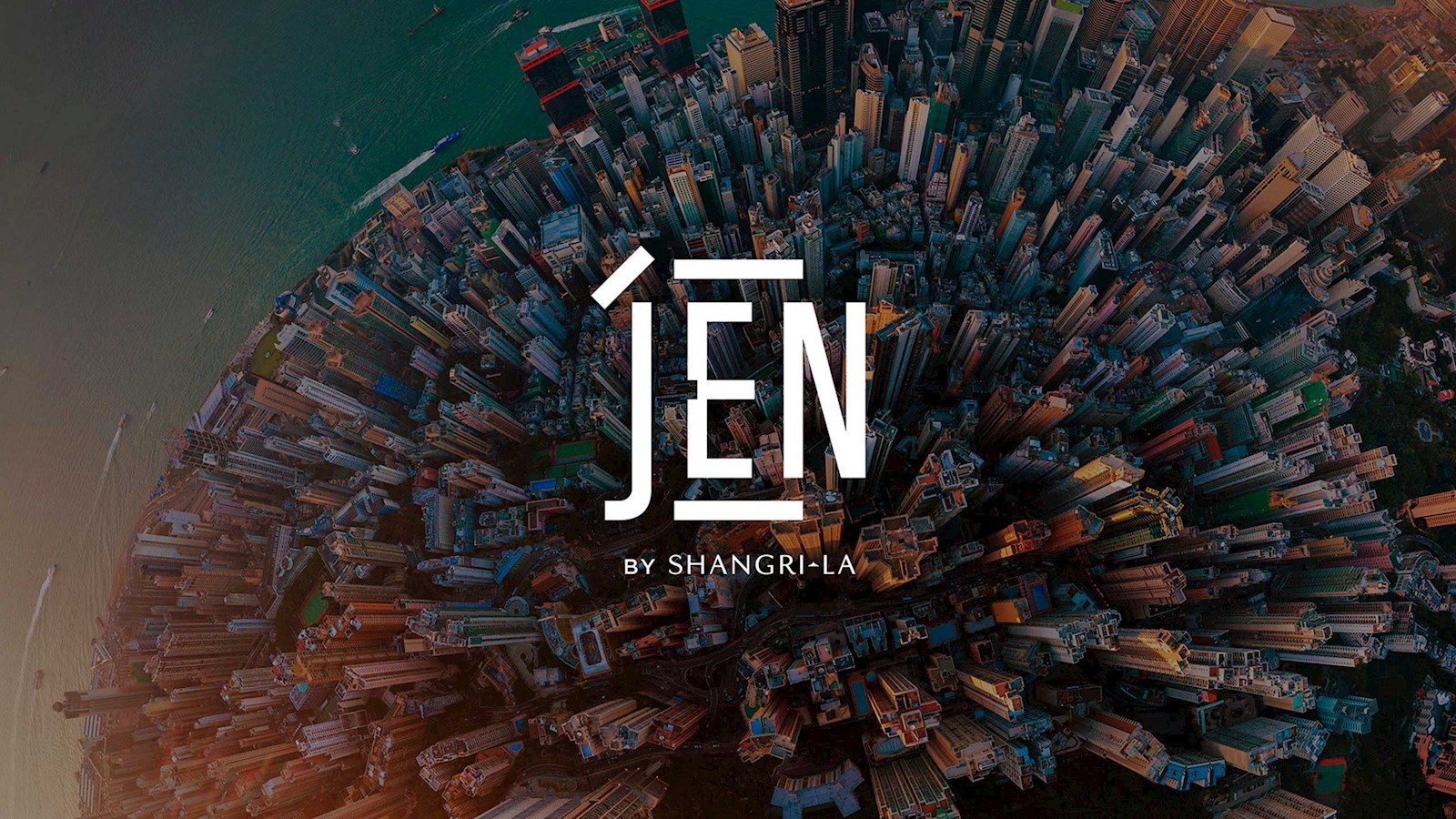
Re-branded as JEN by Shangri-La, an innovative dual-language logo sits at the heart of the new visual identity. The Chinese character ‘rén’, which represents benevolence and harmony, has been seamlessly combined into the brand name to build inclusivity for Chinese- and English-speaking travellers alike.
This interpretation of the ‘rén’ symbol has been used throughout the agency’s new bold and expressive visual language. It has also inspired a bespoke new typeface and striking geometric patterns, while a contemporary colour palette ties everything together.
Design Bridge also worked with up-and-coming photographers Tristan Zhou and Vivien Liu to create an distinct photographic style, while the vibrant launch film, along with an array of digital and physical touchpoints, further bring the new JEN brand to life. The new look and identity encourages local immersion, global connections and cross-cultural collaboration at every stage of the brand experience.
