
Design for difference
Lara Sharrock, Sustainability Director, and Mark Wood, Senior Creative Director, at WPP’s Superunion explain how design works at its best when considering difference and accessibility from the outset
“The problem is that design often considers the needs of the ‘typical’ over the different. The result being that the majority of experiences leave people out,” says Sharrock.
“Our philosophy is simple: we need less of the same, and more of the different. We talk a lot about difference – it’s what we do. We're here to create differentiated work and differentiated brands but, actually, we pursue difference to create not just bold, original creative work, but also to make a difference and to reflect diversity in design for different people and their experiences.”
This thinking has brought inclusive design to the top of the agenda. Designers at WPP’s Superunion have been wrestling with a tension: either create differentiated work, or accessible work. Wood says: “When we started the process of defining what inclusive design really means to our work, the key was to find a way to stop seeing these two elements as a tension – differentiation and accessibility aren’t mutually exclusive, and great design should consider both. The important thing is that you need to think about it from the outset.”
Sharrock agrees: “At first, we thought we needed to make all our work accessible to everyone, all the time. Actually, you can't do that,” she says. “It’s all about recognising from the start of any project who you’re designing for and asking the right questions. Inclusive design isn’t a bolt-on, it must be baked into what we do across all levels and touchpoints; from the more granular focal points – such as colour contrasts, typography and video content – to the way we represent people in imagery or illustrations, to creating more accessible reports, and ensuring a diversity of perspectives in our user testing.”
Celebrating Difference and Making Design Accessible are the two core elements of inclusive design at WPP’s Superunion. Each area is then broken down into a number of principles and focal points. Celebrating Difference is based on the principles of design being Human-centric, Empowering, and Complete. Making Design Accessible is an element inspired by the Web-Content Accessibility Guidelines (WCAG), and is accordingly categorised into the principles of Perceivable, Operable, Understandable and Robust.
“Once we defined our guiding principles and focal points, we then thought about them through the lens of a ‘sliding scale’. There’s a minimum consideration in every project – things like colour ratios, or ensuring we accurately represent a broad spectrum of skin tones and sensitively portray disability. These are standard. But for each focal point, there are ways you can further enhance accessibility or representation,” says Sharrock.
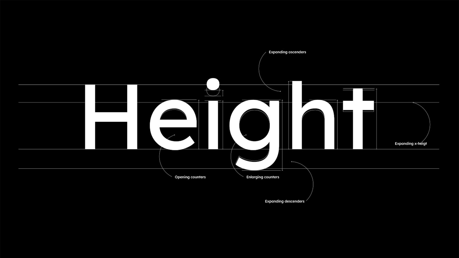
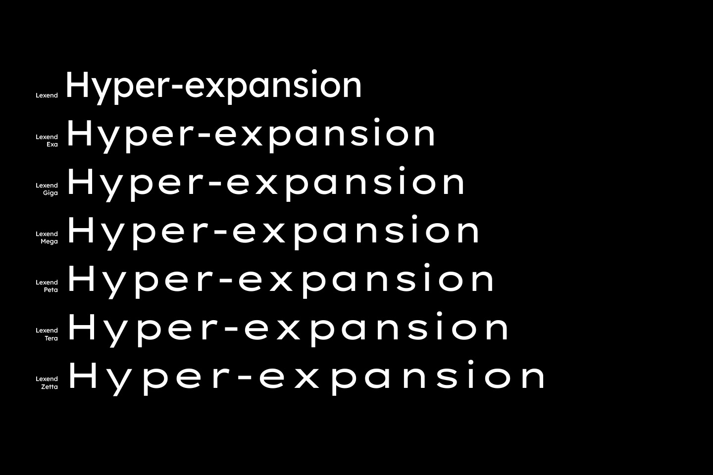
“Take typography for example. When creating a new brand typeface, it’s considered a given that you optimise spacing and line height in relation to the font size”, she says. “But there are a million other things you can do to make typography more legible. We hear a lot about ‘dyslexic fonts’; in reality, if we design for dyslexia, we’ll be improving legibility for everyone. That’s what our Munich studio did in designing ‘Lexend’, which lets users customise the weight and tracking of the font.”
Beyond the creative work, there is also work to be done around naming brands. “We always check brand names in different languages,” says Wood, “but we can go further and think about accessibility. Aspects like phonetics and gendered language are key considerations that must be resolved early on.”
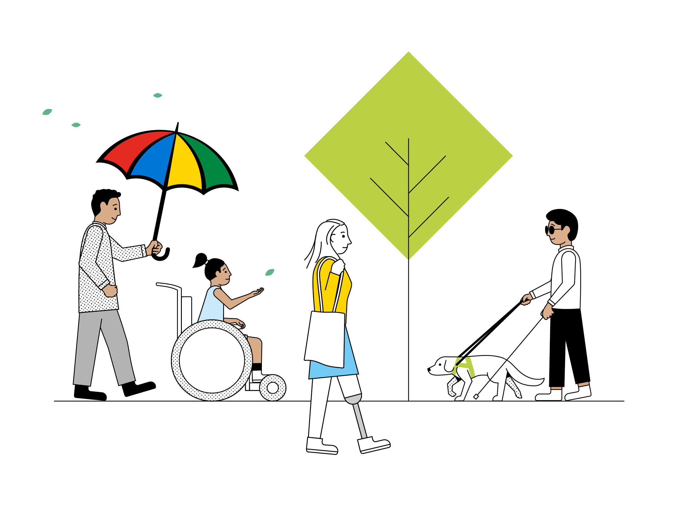
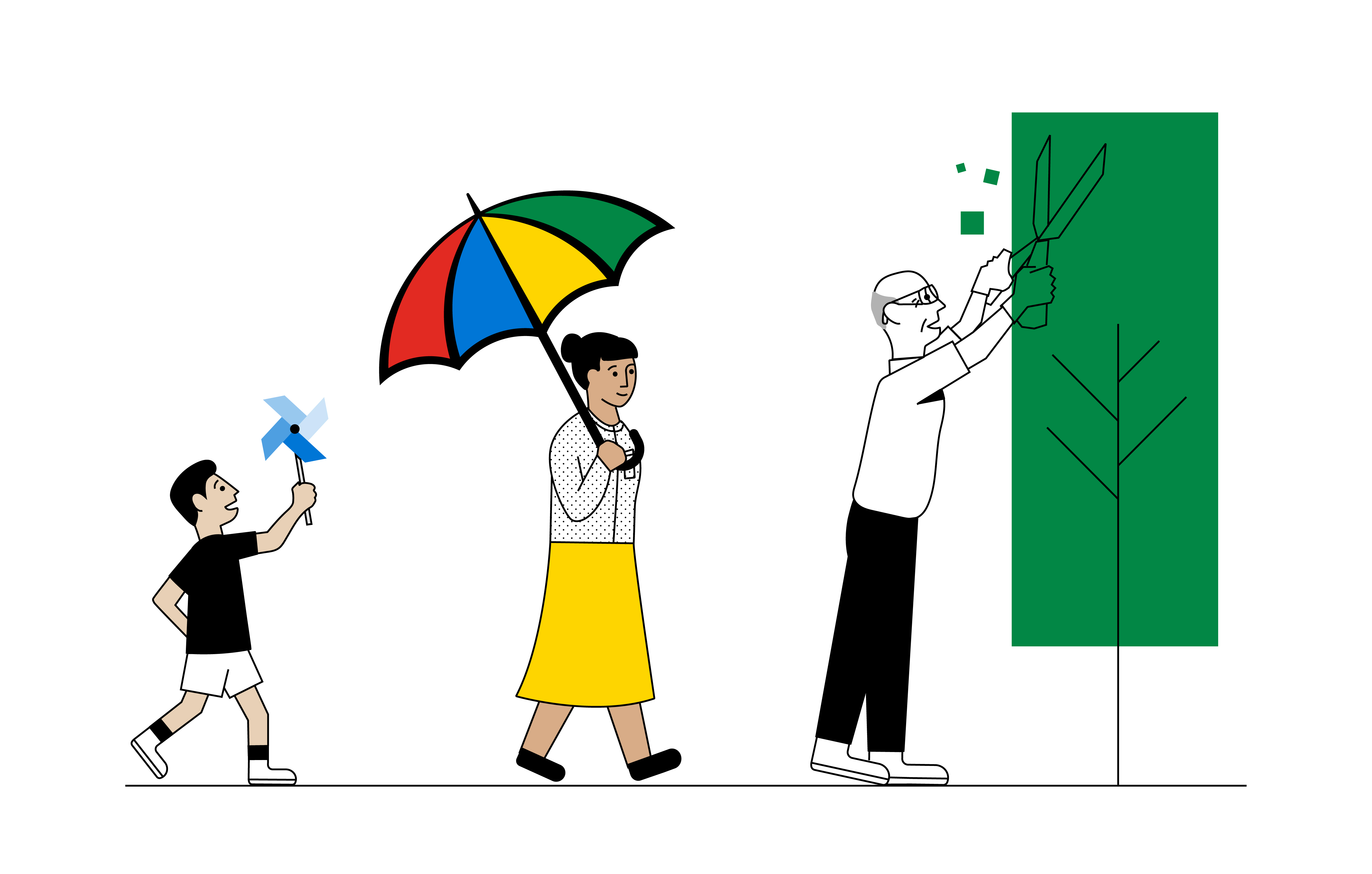
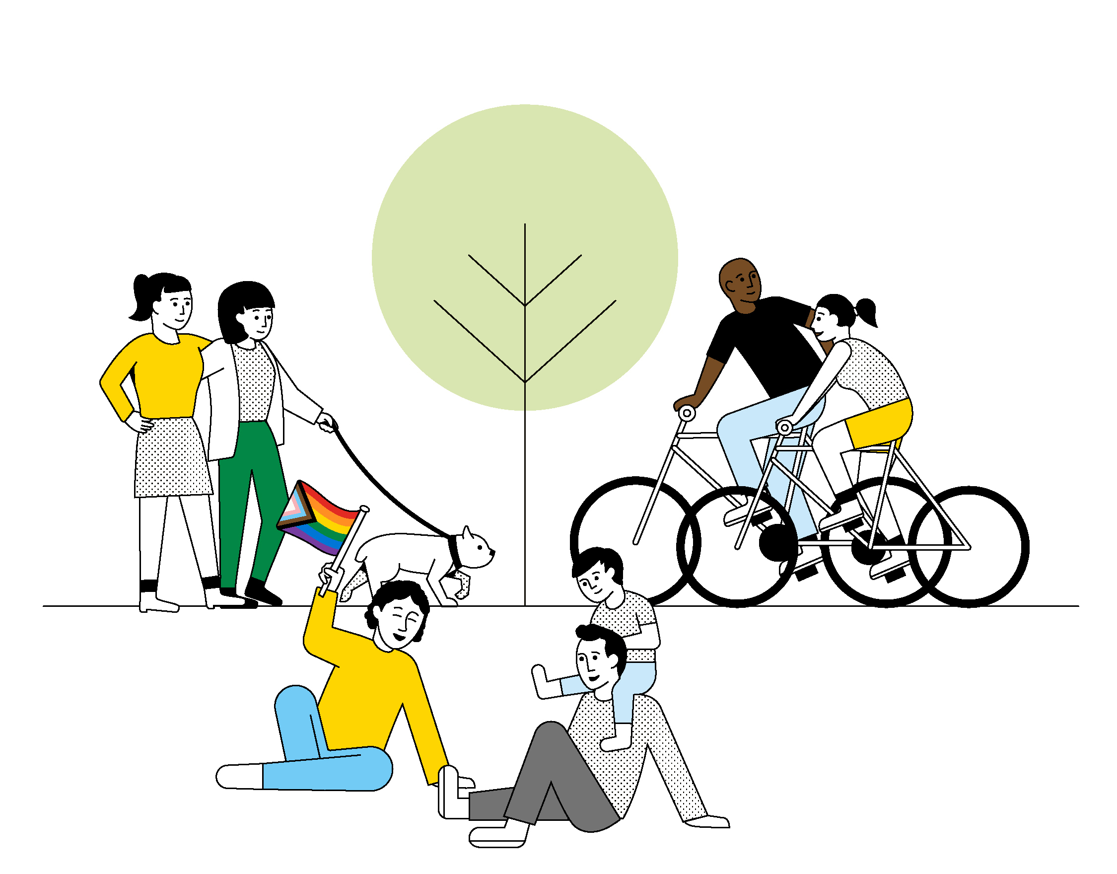
“And, of course, the work we do in this space for any client needs to feel intuitively aligned with their brand. When we helped Legal & General with its illustration and photography guidelines, we needed to ensure that any characters were realistically represented in line with the brand personality”, he says. “That’s why we depicted characters as taking part in positive natural activity.”
In the end, it’s all about being considerate of those we are designing for and prioritising an intersectional view of people and design.
“It’s such an evolving space, and the guidelines for brands really aren’t defined. We’ve seen lots of pockets of expertise and attempts to define principles, but these are generally skewed to one aspect of brand-building, such as the WCAG which focuses on web content. There isn’t anything entirely comprehensive, spanning across all elements of brand-building, that we’ve seen,” says Sharrock.
“We’re still learning every day, but we needed to pull everything into one place to create something that feels tangible. That’s why we’ve spent the last year doing this,” she says.
Wood adds: “Collaboration has been key. We developed our principles with teams across the agency, together with key partners including Monotype, Test Partners and Massive Music.”
Ultimately, it all comes down to our overarching belief: we need less of the same and more of the different.
published on
30 November 2022
Category
More in Experience
Let’s add audio for visually impaired audiences
How to make advertising more accessible for visually impaired audiences

The Future 100: wellbeing, humanity, emotion and tech
This annual trend spotter – by WPP’s VML – gives us the context for the new normal for marketing in 2024.
Activating sports events – the ultimate balancing act
WPP Sports Practice takes a look at the art of timing for sports event activation