Superunion: Madrid Nuevo Norte’s Reimagining Madrid

Superunion: Madrid Nuevo Norte’s Reimagining Madrid
A regeneration project to transform Madrid
The regeneration of the Madrid Nuevo Norte neighbourhood is one of the most important urban transformation projects not only in Madrid but the whole of Europe.
To reflect the size and scale of this transformation, the branding for the new neighbourhood needed to create a strong impact and symbolise one of the greatest projects in the history of the Spanish capital.

The challenge given to Superunion was to create a recognisable brand for the new neighbourhood that would reflect the character of the local community, while demonstrating how inviting the area is to international talent and investment.
To do this, the agency created a strategy based on the idea of union, not only on a local level between people in the city of Madrid but also at an international level between Madrid and the rest of the world. It involved reimagining the capital in its entirety, with all the possibilities for the future that this might entail.
The strategy sought to unite the traditional with the cosmopolitan, putting people at the centre, and creating an icon of excellence and commitment to sustainability. Inspiring optimism and resilience were also core to a concept aimed at those with their sights set on a new Madrid.
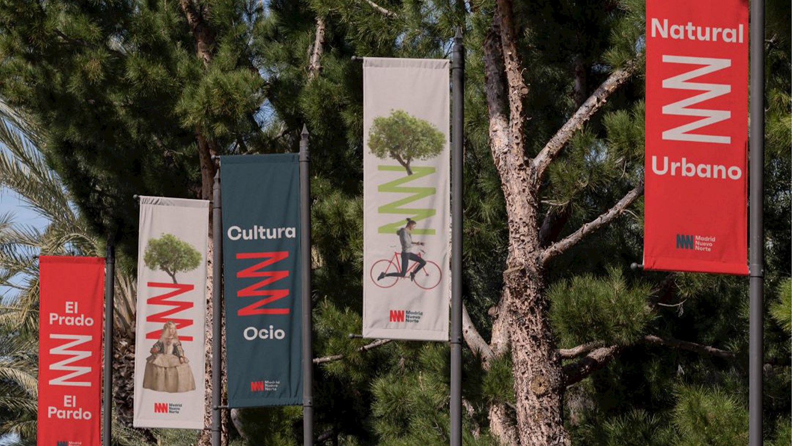
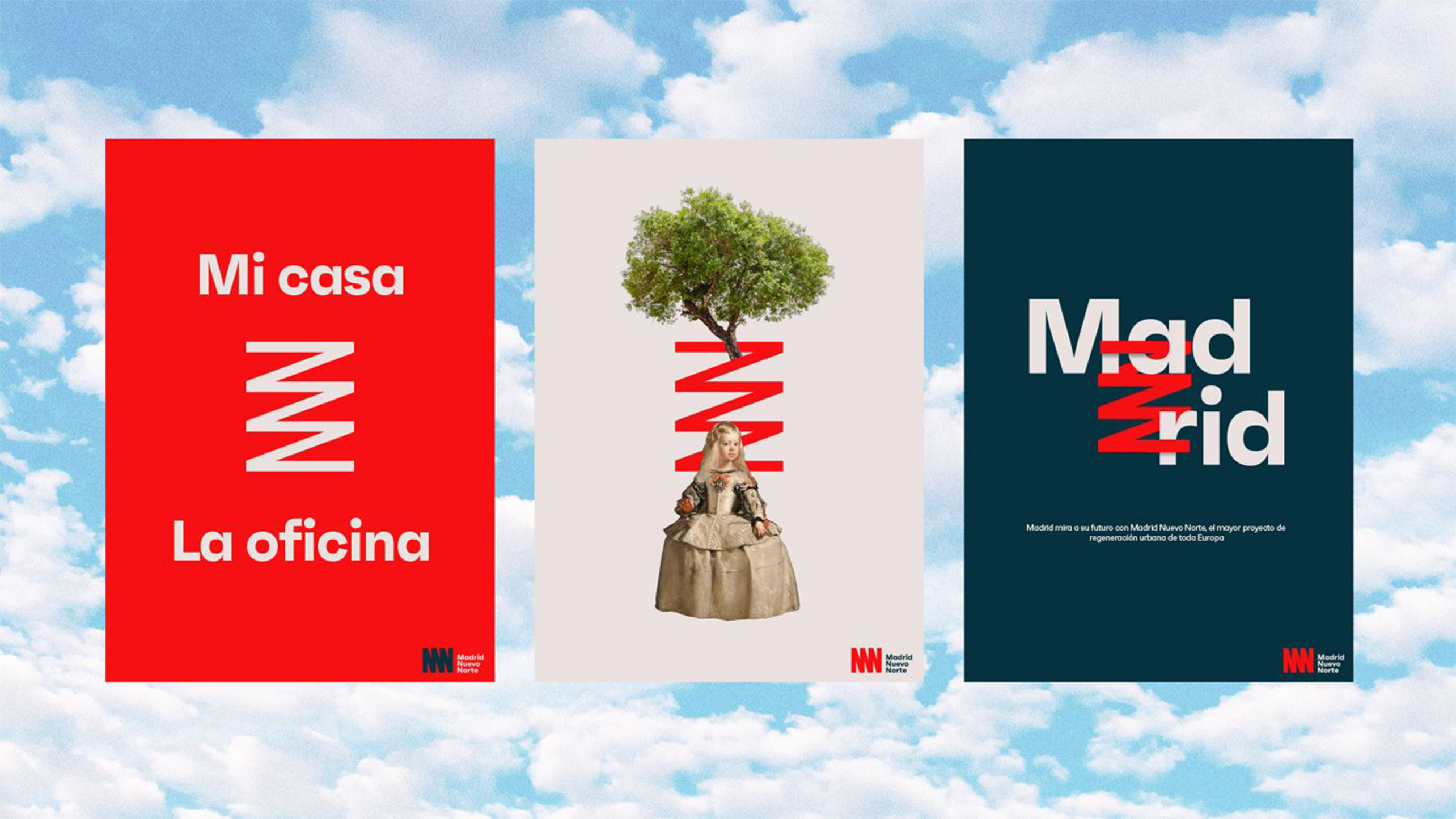
An iconic visual identity was created, proudly celebrating the traditional aspects of the neighbourhood and at the same time its emerging cosmopolitan nature – a reflection of a city connected to the world and faithful to the spirit of Madrid.
The logo incorporates the M, the two Ns of Madrid Nuevo Norte, and symbolises the union of historically separate neighbourhoods, ideas and cultures.


