
X
Superunion and Landor: WPP’s radical evolution

Superunion and Landor: WPP’s radical evolution
The story behind WPP’s new brand identity
To reflect the new strategic direction of the company, WPP has launched an evolution of its brand identity.
Superunion and Landor collaborated to create the new identity which represents WPP as a creative transformation company that is dynamic, connected and organised around the needs of its clients.
The logo is made up of many parts that combine to form the whole – a representation of WPP’s people, agencies, capabilities and markets that work together as one for clients.

Our ambition was to present WPP with the same energy and creativity that we offer to our clients right across the company. There’s a lot of pride and ambition in WPP that is now united under a strong and dynamic brand identity

WPP has always been transformative – bringing together the best people and ideas to meet the needs of our clients. We now have an evolved brand and expression of purpose that better reflects who we are as a company, our collective capabilities, and what we offer
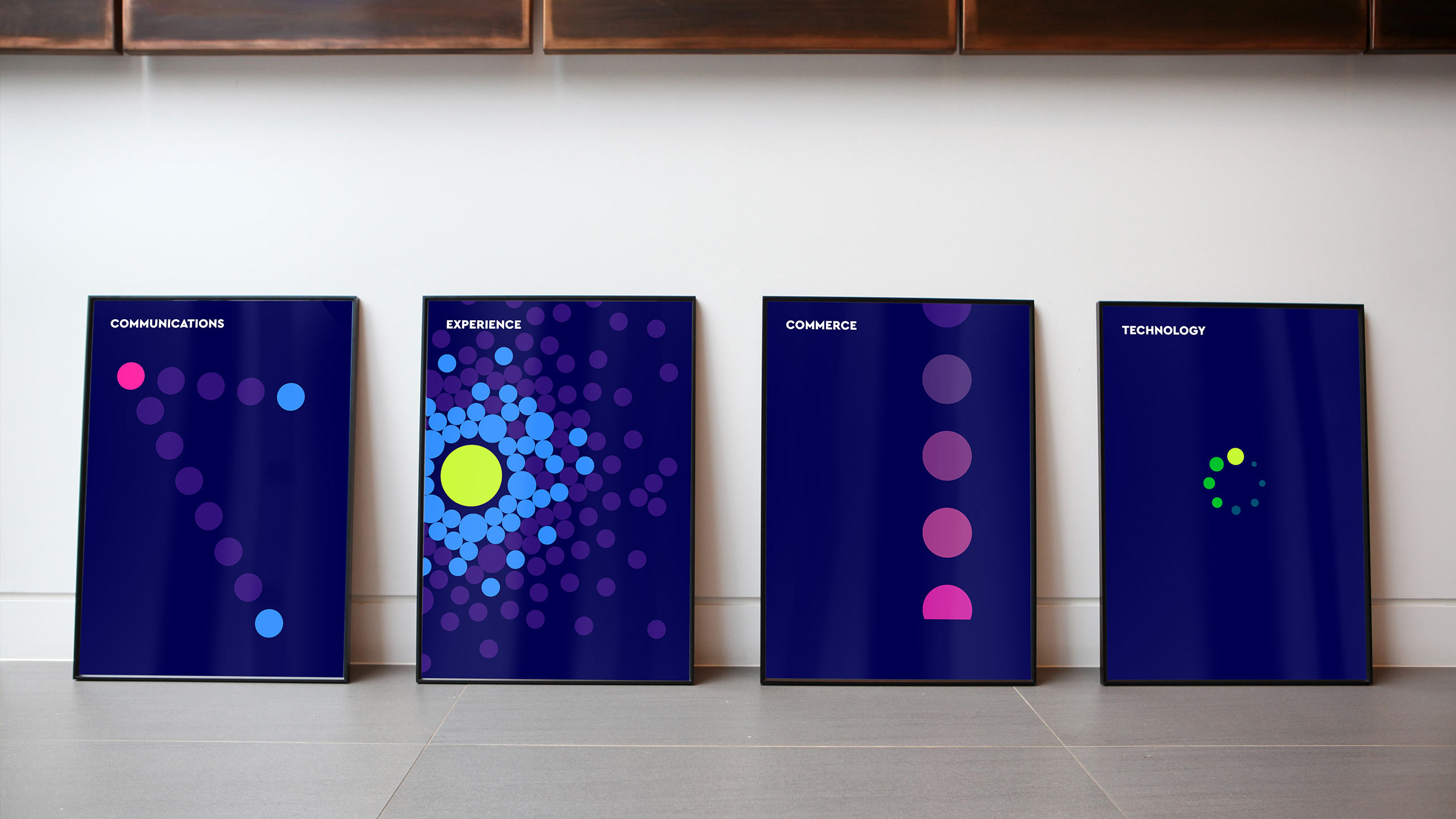
On-screen it is designed to have a continuously changing form and colour, symbolising creative transformation in itself.
The Superunion/Landor team worked alongside WPP’s central team on the new positioning as a dynamic, forward-thinking company with creativity and technology at its heart, and the core purpose of creating better futures for its clients and people.
